
A multi-step enquiry form can make a longer request easier to follow when the questions fall into useful groups. Before approving it, ask the designer to demonstrate the journey backwards as well as forwards. Customers need to review an earlier answer, correct it and continue without unnecessarily typing the rest again.
Start by removing questions the business does not need at first contact. Then compare a clear single-page form with the proposed steps. More screens do not establish that a form will attract more enquiries or better customers.
Give Each Step a Clear Job
Ask the person handling enquiries why each question is needed now. Our trade enquiry form-fields guide helps make that decision. Splitting unnecessary questions across several screens leaves the underlying work for the customer unchanged.
Once the inputs are justified, group related questions. A project enquiry might separate information about the proposed work from contact details, with a review before sending. A short callback request may be clearer on one page. There is no universal field count or number of steps that settles the choice for every business.
The W3C multi-page forms tutorial recommends logical groups, understandable progress and clear handling of optional stages. Use that guidance to discuss the actual form, rather than adding a progress bar to an unfinished questionnaire.
Ask to see the real labels and the longest realistic answers in the draft. “Step 2” gives less context than a heading that also explains what the person is doing. If an answer changes the number of later steps, the designer should show how the progress information stays understandable.
Keep Moving On Separate From Sending
Agree what each control does. A Next button should make its immediate purpose clear. The final action should explain that the person is sending an enquiry, if that is what the system does. Completing a screen is different from submitting the whole request.
Likewise, a review step should let someone check useful information before the final action. It should not look like a receipt for a request that has not been sent. Our enquiry confirmation guide covers the separate messages for sending, acceptance and an uncertain result.
Ask when entered details reach the server or another service. Some systems may save information before the final button; the designer needs to explain the proposed behaviour and the business's information-handling requirements. A progress screen alone does not tell you whether a draft has been saved or an enquiry received.
Ask for one demonstration that goes forward, returns to an earlier answer, corrects it and continues. A tidy first screen does not show whether that return journey works.
A Worked Example: Correct the Suburb Without Starting Again
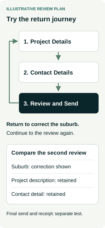
An example joinery business is reviewing a project enquiry form. Its proposed groups are Project Details, Contact Details and Review and Send. These are illustrative groups, not a recommended specification for every joinery business.
The test visitor describes a built-in cupboard, enters a suburb and adds the contact detail requested by the form. On the review step, they notice the suburb is wrong. The designer demonstrates how to return to Project Details, correct it and reach the review again.
The useful comparison is between the two review views. The suburb should reflect the correction. The project description and unrelated contact detail should remain available within the agreed form behaviour. If changing an answer affects later questions, the form needs a clear way to review the affected answers too.
The owner also asks for a missing-contact-detail example. The message should identify what needs attention and give the person a way to fix it. The W3C form-notification guidance supports clear error explanations and a route to the relevant field. An error on one step should not silently erase unrelated work.
| Review journey | What to demonstrate | What to compare afterwards |
|---|---|---|
| Move to the next step | Complete the current required details and continue. | The next group and progress information make sense. |
| Correct an earlier answer | Return from review, change the suburb and continue. | The corrected suburb appears; unrelated description and contact details remain. |
| Fix a missing required detail | Trigger a controlled correction message in test mode. | The field is identifiable and other entered answers remain available. |
| Reach the final send action | Review the request before the agreed submission test. | The final control is distinct from Next; completion and receipt have their own checks. |
This example is a review plan. It does not report a working client form, a delivered enquiry or an increase in completed requests.
Check the Phone, Keyboard and Back Controls
Use a narrow-screen preview with realistic labels and answers. Check that the current step, errors and controls remain readable when the on-screen keyboard takes space. A desktop window resized to phone width is useful layout evidence; an actual phone can reveal different input behaviour.
Ask the developer or accessibility reviewer to check keyboard focus when a step changes or an error appears. W3C's forms tutorial covers labels, instructions and feedback alongside multi-page behaviour. A visible progress marker does not establish that someone using a screen reader can understand the change. Discuss the wider review through our accessibility quote guide.
Test the form's own Back control and discuss what the browser's Back button does in the proposed implementation. Do not assume they use the same route. Also ask what happens after a refresh, a closed tab or an expired session. Keeping answers during step navigation is different from offering a save-and-return service across visits.
Agree any draft storage, expiry and recovery wording explicitly. Retaining information should fit the business's actual privacy and security arrangements. Do not imply that a visitor can safely leave and return later unless that behaviour is included and checked.
Put the Return Journey in the Website Scope
Give the designer a short set of justified questions and one correction journey to demonstrate. Record which controls return to earlier steps, which answers remain available and when the final send occurs. If files are part of the request, use the separate upload-handling guide to agree what happens to them as well.
Arrange any submission test with the website owner, including test details, destination and cleanup. Check the customer-facing result separately from receipt by the business. A successful trip through the screens does not prove delivery.
When discussing AWE's website packages, bring us the proposed steps and correction example. Ask how the form behaviour, testing and any draft-saving requirements would be scoped for your website.