
A one-page website can suit a business whose customers need one clear explanation before getting in touch. Several pages can suit a business where people arrive with different questions and need a direct route to the relevant information. Choose the structure by walking through those customer tasks, then compare quotes for the work required.
There is no useful universal page count for an Australian small business. A short site can leave important questions unanswered. A larger site can spread a simple explanation across unnecessary clicks. Both can make contacting you harder if the information and next step are unclear.
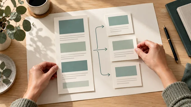
Before choosing a package, sketch how someone will use the proposed website. Include a person arriving through the home page and a person following a link you send them. That second journey often reveals whether one long page will be practical.
Understand What the Two Structures Mean
A one-page site puts its main business information in sections on a single page. Menu items may jump to a section such as Services or Contact. A multi-page site gives selected subjects their own pages, connected through navigation and contextual links.
Count actual pages and destinations, rather than menu labels. A menu with six items may point to six sections on the same page. Conversely, a website sold as a one-page site may also include separate policy pages or an external booking destination. Ask the provider to show what is included and where each link goes.
MDN's HTML link documentation explains links to sections within a page. For example, #contact can identify the contact section. That gives someone a useful shortcut within the document; it does not create a second content page.
This choice is also separate from whether you use a builder or hire a designer. Either route may produce either structure. Our builder-or-designer comparison covers who completes the work. Here, the decision is how customers should move through the finished information.
Test the Entry Points Customers Will Use
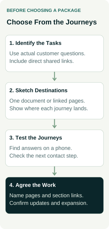
Write a few real reasons someone would visit. Use the questions you receive in calls or emails, the links you expect to share and the services you currently offer. Keep future plans clearly separate from work customers can buy today.
Start with the home-page journey: can a new customer understand what you do, whether it suits them and how to enquire? Then try a direct journey: if you send a link about one particular task, does it land where the answer starts?
Use these prompts to sketch the journeys:
- A referral wants to check the business and request a discussion.
- A customer asks for the information about a particular job.
- A returning customer wants the current contact or service details.
- Someone wants to read a project example or guide you have shared.
These are prompts, not a requirement to create four pages. Replace them with your actual customer tasks. Draw the starting point, the information needed and the next action for each one. Mark where different journeys share the same explanation and where someone must work through unrelated material.
A one-page layout may handle the shared explanation comfortably. Separate pages become worth considering when they give people a useful direct destination and a clear way back to related information. If you are assessing one specific service, use our separate-service-page decision guide for that narrower choice.
Compare the Structure Against the Required Work
Ask a provider to demonstrate the proposed journeys in a simple outline or draft. You can compare the following practical points before discussing colours and visual style.
| Planning Question | One-Page Route to Check | Multi-Page Route to Check |
|---|---|---|
| Where does a shared link land? | The right section opens with enough context to make sense. | The destination answers the task and offers relevant next steps. |
| Can someone find the next action? | The contact route is easy to reach without losing their place. | Contact is clear from the relevant page, without a forced trip home. |
| How will information be updated? | A change remains clear within the full page. | Shared details stay consistent across the places they appear. |
| Where will confirmed new material go? | The layout has an agreed way to accommodate it. | The provider explains how a new page is added and connected. |
Page count alone does not settle cost. Writing, images, integrations, revisions and checking all contribute to the work. A carefully developed one-page site may include more work than a basic collection of pages. Compare the actual proposals, including what you must supply and what later additions will cost.
Separate pages also need a navigation plan. Someone who arrives directly on a project page should be able to understand the business, find related services and contact you. Ask to see that route rather than assuming the home-page menu will solve every journey.
Agree the destinations and customer journeys before treating a page allowance as the finished scope.
Check the Draft on a Phone
Read the proposed content in the intended layout on a phone. Start at the top, then enter through one of the links you would send a customer. Can you find the answer without searching through a long gallery or opening several pages that repeat the same introduction?
A long page is not automatically a problem. Clear headings, useful section links and a sensible reading order can help. Several pages are not automatically easier either: vague menu labels and repeated content can leave people unsure where to go.
Ask someone unfamiliar with the business to attempt a task, such as finding the information needed to request a particular job. Watch where they hesitate. Record the missing answer or confusing destination, then discuss a specific correction. Do not turn one person's attempt into a measured conversion result.
Check the actual images and functions too. A page with oversized photos or an awkward embedded tool can be slow or difficult in either structure. Request the relevant layout and performance checks in the scope; the number of pages does not prove speed, usability or accessibility.
A Worked Example: A Small Upholstery Business
This is an illustrative business, not an AWE client or a performance result.
Example Upholstery initially offers residential chair re-covering. Customers need to see the kind of work offered, check the area served, understand what photographs to provide and request a discussion. Its owner has a small set of approved project photos and one enquiry process.
The owner sketches those tasks on a single page. A section link takes a referred customer to the chair information, while the opening section gives a new visitor the business context. If the draft explains the work clearly and the contact route is easy to find, a one-page structure is a reasonable option to discuss. The decision still depends on the actual quote and checks.
Now suppose the business confirms a separate commercial seating service. Facilities managers need information about site assessment, project scheduling and how to discuss a larger job. The owner also wants to share individual completed-project explanations with prospective customers.
Those direct destinations make a multi-page outline worth assessing. The owner can ask for a home page, the confirmed service explanations and project pages with a clear enquiry route. The final scope should name the pages and supplied material; it should not rely on a promise that the site can “grow later”.
If the commercial service is only an idea, hold it outside the public plan. If project material is unavailable, do not add empty pages to reach a package allowance. The owner can commission the current work and ask for a separate explanation of future expansion, without pretending that expansion is included.
Keep Search Expectations Specific
Separate pages provide separate places to explain distinct subjects and link to them. That can be useful for customers arriving through search. It does not establish that every additional page will be indexed, rank well or attract suitable enquiries.
Google's SEO starter guide recommends logical organisation and helpful, readable information. It does not prescribe a small-business page quota or guarantee first-place rankings. Apply that guidance to the content and navigation you need.
Google's URL structure guidance says it generally does not support URL fragments for changing page content. Treat section shortcuts as navigation within one document, rather than selling each shortcut as a separate searchable service page. Ask the provider to explain the actual URLs and how the content is delivered if their proposal depends on that distinction.
Neither structure proves an AI citation outcome. Avoid choosing more pages because someone promises that AI tools will recommend the business, or rejecting one page because someone says it cannot appear in search. Request the evidence behind a specific claim and keep it separate from the layout decision.
Take a Journey Sketch to the Quote Discussion
Bring the proposed destinations, the information you can supply and the tasks customers need to complete. Ask the provider to confirm actual pages and section links, content responsibilities, phone checks and how agreed future additions would be priced and delivered.
Our trade website brief helps organise the wider project. Compare AWE's current website packages against your requirements, then talk to Matt with the journey sketch and any existing site. Agree the proposed structure and work before accepting a quote.