

Choose the photo pair and the difference a customer needs to understand before approving a comparison slider. Ask the designer to show whether the proposed reveal helps that comparison on a phone and with a keyboard, and keep the project explanation available alongside it.
A before and after slider usually lets someone move a divider to reveal more of one photograph over another. It can be useful when the images align and the visible change matters. Two clearly labelled images may communicate the same information with less interaction.
For an Australian business owner reviewing a website quote, agree the purpose, approved photos, display behaviour and review scope. A draggable effect alone does not establish that the pair is informative, the controls are usable or more customers will enquire.
Start With the Comparison the Photos Can Support
Name what a visitor should notice: a changed layout, a repaired surface or a documented stage of work. Check that both photographs belong to the intended project and that their labels describe the actual stages. A progress image should not silently become an “after” image implying completion.
Use the project-gallery guide for permission, privacy, captions and evidence behind the work. This article concerns the comparison presentation once the images are suitable for the proposed use.
Compare viewpoints, framing and useful landmarks. If a wall edge moves across the frame when the divider moves, the apparent difference may come from camera position rather than the work. Ask whether a static pair with an explanation would be clearer than an overlapping reveal.
Keep important context visible. The photographs may show appearance without establishing hidden workmanship, durability or a financial outcome. The caption should describe the business's supported scope rather than let the moving image imply a larger claim.
Compare a Static Pair With the Proposed Reveal
Ask for both options using the same approved images and wording. A static pair can show the two views together or one below the other on a narrow screen. A sliding reveal may help someone inspect a similar area, but initially hides part of each image.
Have the designer explain the starting position and how a visitor discovers the control. Can someone see enough to understand that two views are available? What happens at each end of the movement? Keep “before” and “after” labels understandable throughout the comparison.
Review the actual image fitting on a phone. Cropping each source to fill one shared frame can remove a landmark or cut away the detail you intended to compare. Our homepage crop guide explains why a frame change needs more than a larger image file. Here, both members of the pair need attention together.
If useful detail still cannot be seen, consider another approved view or a separate explanation. Do not stretch one photograph or alter the documented work to force a persuasive match.
Agree How People Operate the Comparison
Ask the provider to show how the actual control works with a mouse, touch and keyboard within the agreed review. A decorative line and handle do not demonstrate that interaction. Someone should be able to recognise what the control changes and which part currently has keyboard focus.
For implementations that use a range slider, W3C's slider pattern describes keyboard operation and accessible naming and value information. It also warns of difficulties with some touch-based assistive technologies and calls for testing on relevant touch devices before production use.
A provider might use a browser range control or a custom component. Ask it to explain the chosen implementation and demonstrate the delivered behaviour. A component name or claim that it is “accessible” is not the review evidence.
Agree what customers can use when the interactive presentation does not meet their needs. A labelled static pair and clear text explanation may be an appropriate part of the page. Keep the intended comparison understandable rather than requiring everyone to discover the same gesture.
Our accessibility scope guide helps define the methods and coverage. One slider review does not establish conformance for the whole website.
Keep the Image Meaning Outside the Moving Divider
Include the project type, relevant work and comparison limits in ordinary page text. An instruction such as “drag to compare” explains an action, but does not explain what the two views show.
W3C's informative-image guidance says text alternatives should convey the information or meaning supplied by the image. Have the designer consider each photograph's role and the comparison as a whole. A generic “before photo” label may leave the important visible difference unexplained.
Review captions and labels with the real photographs, not placeholder pictures. If the feature also opens a larger view, use the image-lightbox guide to scope opening, closing and return separately. Do not assume enlargement is included merely because a comparison control is included.
Approve the pair, the explanation and the control behaviour together. Keep an unresolved image or interaction check open.
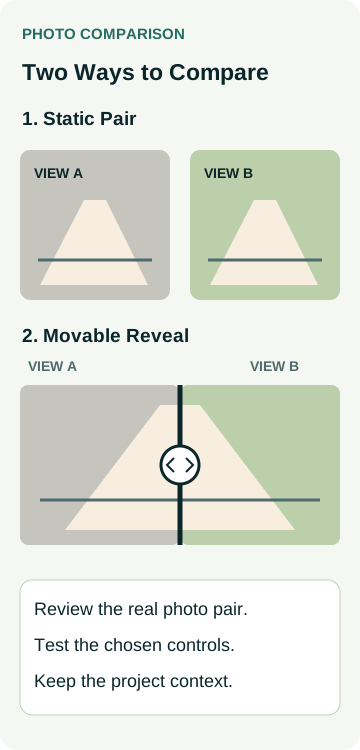
A Worked Example: Comparing a Documented Surface Change
Imagine a paving business with approved photographs from the same documented project. The owner wants customers to understand a visible surface change. This is a hypothetical review exercise, not an AWE client, genuine project comparison or tested component.
The designer first shows a labelled static pair, then proposes an overlapping reveal. The owner notices that the second photo was taken from farther to one side. A boundary edge does not line up, making the divider movement look like a larger physical change.
They retain the original photographs and explore whether another approved view or the static presentation explains the work better. They do not fabricate a matching scene. The implementation choice remains unresolved until the images and proposed control can be reviewed coherently.
Use this record with the provider:
| Review Area | Decision to Agree | Evidence to Request |
|---|---|---|
| Photo pair | Project, stages, useful difference and publication permission | Identified originals, approved public copies and factual caption |
| Presentation | Static pair or interactive reveal and initial view | Same images shown at desktop and narrow-phone sizes |
| Controls | Discovery, movement, focus and relevant input methods | Actual component review, including agreed touch and assistive-technology scope |
| Explanation and upkeep | Labels, text alternatives, context and later replacement | Approved wording, named owner and unresolved checks |
The diagram and record describe a design decision. They do not show a working slider, measured accessibility, a completed paving job or a conversion improvement.
Include the Feature in the Website Handover
Agree who prepares replacement images and checks the pair when staff update a project. Matching file dimensions alone does not establish that the new photographs show the same area or stages. Keep the caption, labels and text alternatives with the image decision.
Record any added component, ongoing dependency and maintenance responsibility in the quote. During the website launch review, check the agreed comparison and customer route in the delivered public version. Keep a visual approval separate from the functional review and any later business measurement.
To discuss the feature, review AWE's website options or contact Australian Web Experts with the photo pair, useful difference and preferred customer task. Ask which image preparation, controls, review and handover work the actual proposal includes.