
Before adding click-to-enlarge photos to your website, choose one detail a customer needs to inspect. Ask the designer to show that detail in the larger view, keep the image's context understandable, and demonstrate closing it and returning to the gallery. A bigger picture is useful when the whole journey helps someone assess the work.
A lightbox usually presents a larger image over the page after someone selects a thumbnail. A normal image, a link to an image file and a lightbox can behave differently. Agree the proposed behaviour before approving a gallery feature in your website quote.
Choose What the Larger View Helps Someone See
Start with a real customer question. Someone considering a joinery project might want to inspect a cabinet handle, while another visitor needs the overall room layout. Use an approved image that contains the detail at a useful quality. Enlarging a small or blurred file does not create missing detail.
Ask the designer to compare the normal page image with the proposed larger view on a phone and desktop. If neither makes the relevant detail clear, consider a closer approved photograph or a separate detail view. The project-gallery guide covers selecting images and supporting captions before deciding how they open.
Keep the photograph's role honest. A larger view can show visible appearance; it does not prove hidden workmanship, product performance or a measured customer result. Recheck the public image at the larger size, including any identifying material that was hard to notice in the thumbnail.
Make the Opening Action Understandable
Have the designer show how a visitor knows an image can be opened. An unexplained hover effect is insufficient for someone using a phone or keyboard. Ask what the control is called and which image it opens.
W3C's functional-image guidance explains that an image used as a control needs an alternative that communicates its function. The developer should distinguish the opening control's purpose from the information conveyed by the photograph itself.
Agree whether selecting an image opens an overlay, a project page or the original image file. Do not make a customer discover the difference through trial and error. A project page may be more useful when the visitor needs a detailed explanation alongside several related photographs.
Keep the Image and Its Context Together
Use the actual caption in the demonstration. A visitor viewing an enlarged image should still understand which project or detail they selected. If a collection includes stages of work, keep the distinction between progress and finished photographs clear.
If the viewer lets someone move between images, agree how it identifies the current item and how the caption changes. Test the first and last images as well as one in the middle. A particular plugin's arrows, swipe gestures or looping behaviour should not be assumed for every proposed gallery.
This is separate from deciding whether a homepage should rotate automatically. Our rotating-banner guide covers that choice. Opening one image deliberately does not require an automatic slideshow.
Review opening, inspection, closing and return as one task. The enlarged image is only one state of the feature.
A Worked Example: Inspect a Handle, Then Continue Browsing
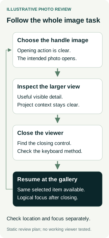
An example joinery business is reviewing a gallery with a room photograph and a closer cabinet-handle photograph. The owner wants customers to inspect the visible finish and then continue reading the project description. This is an illustrative design review, not a completed client website or a measured enquiry result.
The test starts at the handle thumbnail beside its caption. The designer opens the proposed viewer, shows the larger image and its context, then closes it. The owner checks that the same gallery area remains available and that the next action is clear.
The keyboard review checks where focus goes when the viewer opens and where it returns after closing. The phone review checks whether the closing control and caption remain usable at the same time as the image. If the detail becomes tiny because the controls occupy the screen, the proposed layout needs another look.
| Part of the journey | Demonstration to request | What to inspect |
|---|---|---|
| Open the chosen image | Use the actual thumbnail and opening control. | The intended handle image opens and the action is understandable. |
| Inspect the detail | Show the larger image with its caption. | The detail is useful and the image remains connected to its project. |
| Close the viewer | Use the visible close control and the agreed keyboard method. | Closing is available without guessing an undocumented gesture. |
| Continue on the page | Return to the gallery and resume reading. | The original location and a logical keyboard focus position are available. |
Record a problem specifically. “After closing the handle image, focus moves to the top navigation” gives the developer a clearer issue to investigate than “the gallery feels awkward”. Any repaired behaviour still needs a retest on the relevant version.
Include Modal Behaviour in the Accessibility Review
Ask whether the proposed viewer is a modal dialog. A modal temporarily prevents interaction with the page behind it. That is different from opening an image in another tab.
For a modal implementation, the W3C dialog pattern describes focus moving inside when it opens, Tab navigation staying within it, Escape closing it and focus normally returning to the initiating control. The pattern also describes exceptions where another focus destination better fits the workflow. Ask the developer to explain and test the choice for this gallery.
MDN's dialog documentation recommends an explicit closing button so users have a clear way to dismiss a dialog. Do not rely only on clicking the dimmed background or knowing a gesture. A visible control still needs an understandable name and an implementation check.
Put the viewer's opened and closed states in the accessibility review scope, including keyboard and relevant assistive-technology checks. Installing a lightbox or using a native dialog does not establish whole-site accessibility conformance. The pop-up guide covers the wider choice of optional overlays and their effect on a customer's task.
Agree the Feature and the Evidence in the Quote
Give the designer one approved photograph, its intended inspection detail and the caption. Ask for a demonstration from opening to return, using the proposed page rather than a plugin's marketing example. Review how larger files are loaded and assess the actual page under recorded conditions if loading is a concern; no particular viewer guarantees speed or search improvements.
Keep visual acceptance separate from interaction checks. A screenshot can show the image and caption, while keyboard focus, closing and return require the working component. The website draft-feedback guide helps record those observations without treating a picture as proof of behaviour.
When discussing AWE's website packages, bring us the gallery image and inspection task. Ask how the chosen opening behaviour, responsive presentation and interaction testing would be scoped for your website.