
Breadcrumbs can help someone who lands on an inner page understand where it belongs and open a broader category. They are worth considering when that parent route helps a real task, such as comparing other products or finding related guides. A small, flat website may already provide that route through its menu and page links.
Before adding a trail to a website quote, ask the designer to show it on one real page. Follow each proposed parent link. The useful decision is whether those destinations help the visitor continue.
Start With the Parent Page a Visitor Needs
Imagine a visitor opening a product page from a link in a message. They like the item but want to compare others in the same range. A clear link to the relevant collection gives them somewhere useful to go.
The W3C breadcrumb pattern describes a trail through a page's parents in the website hierarchy. For an owner reviewing a design, hierarchy means the way pages belong within broader sections. The labels should describe that arrangement in words customers recognise.
Start with an existing product, service detail or guide. Write down its proposed parent and open that page. A heading called “Resources” offers little help if its destination is an empty archive. Likewise, putting “Services” in a trail needs a useful Services destination. Creating extra pages solely to fill out a trail adds work without resolving the visitor's task.
Give the Menu, Breadcrumbs and Back Button Different Jobs
The main menu provides starting points across the website. Our guide to website menu labels and customer routes helps decide what belongs there. A breadcrumb trail provides a more local route from the current page to its broader sections.
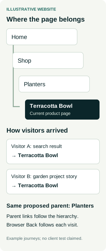
The browser's Back button follows the history of that visit. Someone who opened a product from a search result has a different history from someone who opened it from a project story. Neither previous page necessarily represents the product's parent collection.
A separate “Back to results” control can serve another useful job, such as returning to a filtered product list. Ask what that control restores in the proposed setup. A sequence of selected colours, sizes or sort options does not automatically become a chain of parent pages.
Review the parent route and the arrival route separately. The page hierarchy explains where the content belongs; the visitor's history explains how they reached it.
A Worked Example: One Product, Two Arrival Routes
Consider an illustrative retailer with a product called Terracotta Bowl. Its agreed hierarchy is Home, Shop, Planters, then Terracotta Bowl. The Planters page contains the range a customer can browse.
One visitor arrives at the product from an external search result. Another arrives through a link in a garden project story. Both should be able to understand the same proposed parent relationship. Clicking Planters would open the collection, while using browser Back would follow each visitor's own history. These are example journeys, not results from a tested client website.
For the design review, ask to see the product and collection pages together. Check that the collection contains the item, that its name makes sense on both pages, and that someone can continue comparing products there. A trail can look convincing in a screenshot while its parent destination remains unhelpful.
If the same item appears in both Indoor Plants and Planters collections, have the designer explain the chosen hierarchy. Review the actual platform behaviour before approval. A consistent, meaningful parent route is easier to assess than a trail assembled from every page someone happened to visit.
Choose the Route That Fits Your Website
There is no useful universal page count at which every website needs breadcrumbs. Review the shape of the content and the next task instead.
| Website situation | Review question | Possible decision |
|---|---|---|
| A flat set of service pages | Can visitors already reach the relevant service and contact route easily? | Keep the menu and contextual links clear; a trail may add little. |
| Products inside useful collections | Can someone landing on an item open its broader range? | Consider a breadcrumb trail to the real collection pages. |
| Guides within a resource library | Can a reader find the broader topic from a directly opened guide? | Show the proposed topic route and review its destination. |
| An item listed in several groups | Which parent relationship will the trail communicate? | Agree the meaning and inspect the platform's behaviour on that item. |
A one-page or multi-page website decision comes earlier if the page structure is still unsettled. Breadcrumbs depend on that structure. For a large collection where people need to find a particular item, a website search box addresses a different finding task and needs its own review.
Check the Trail on a Narrow Screen and With a Keyboard
Ask for the longest realistic page and category names in the draft. On a phone, check how the trail wraps and whether each parent link remains readable and usable. Review it alongside the heading so the current page is clear. A short demonstration with placeholder labels can hide the problems that appear with real names.
For implementation, W3C's breadcrumb pattern uses a labelled navigation region. If the current page is linked, it identifies that link with aria-current="page"; the attribute is optional when the current page is plain text. MDN explains aria-current as a way to communicate the current item in a related set. W3C's page-region guidance also explains how regions help people navigate page structure.
During review, follow the parent links using a keyboard and check that focus remains visible. Ask for an accessibility review appropriate to the whole website. Correct breadcrumb markup alone does not establish that the site is accessible; our accessibility quote guide explains how to discuss that wider scope.
Put a Concrete Example in Your Website Brief
Give the designer one current page, its proposed parent collection and two plausible ways someone might arrive. Ask for a draft showing the labels, destinations and mobile layout. Where the platform handles several collections, include an item that belongs to more than one.
Use the website draft feedback guide to report what prevented you from reaching the broader collection. “I opened this product directly and couldn't find the other planters” gives the designer a specific problem to solve.
If you are discussing website packages with Australian Web Experts, send us that example page and parent route. Ask how the proposed navigation work would be scoped for your website.