

Before approving dark mode, agree how visitors choose a theme and which pages and states will be reviewed in both versions. A dark homepage mock-up does not explain what happens to the menu, service details, enquiry form or connected booking tool.
Treat the option as a defined website feature. Ask what customer need it serves, what the quote includes and how the designer will show that each theme supports the same important tasks. A visual preference alone does not establish better enquiries, faster pages or accessibility conformance.
For a small business commissioning a new site or redesign, the useful deliverable is a short theme-behaviour record alongside the actual page previews. It should identify the choice offered to visitors, the design coverage and any parts that need separate treatment.
Decide How the Theme Is Selected
A website can have a fixed appearance, follow a device or browser preference, offer an on-page choice, or combine those approaches. Ask which arrangement the designer is proposing. A dark colour palette and a visitor-controlled dark mode are different scopes.
MDN's colour-preference documentation explains that websites can detect a requested light or dark theme through prefers-color-scheme. That preference can come from operating-system or browser settings. Detecting it does not by itself design the pages or specify how a separate website control behaves.
If an on-page control is included, agree its labels and what happens after a visitor makes a choice. Can they return to following the device preference? Does their choice continue when they open another page? What is intended on a later visit? Ask the developer to explain and demonstrate the proposed behaviour rather than assuming a sun or moon icon answers those questions.
Record the agreed priority when a website choice differs from the device preference. Several arrangements are possible; the finished website needs to follow the one you approved consistently.
Review the Actual Content in Each Theme
Ask for the same service information, headings, navigation and customer actions in both previews. Check whether any text, image or action has disappeared or become difficult to recognise. A theme change should not quietly change what the business offers or where the enquiry button leads.
Look beyond the largest heading. Review secondary descriptions, links, captions, form instructions and important exclusions. A muted detail can matter if it explains the service area or tells a customer what to supply.
Have the designer explain how logos, photographs, diagrams and supplied graphics are handled. A logo prepared for a light background may need an approved alternate asset or a suitable containing area. Do not assume that automatically inverting a photograph preserves an accurate view of the work.
Our font setup guide covers the selected typefaces and fallback arrangement. Theme review adds another question: are the actual words readable in their light and dark surroundings? Keep those checks distinct from whether the preferred font loaded.
Include Controls and Feedback, Not Just Reading
Follow an important customer route in each theme. Open the phone menu, identify the selected control and reach the relevant service and enquiry page. Review buttons, links and keyboard-focus visibility with the website person.
Include the states the first mock-up may not show: an open menu, a selected option, a validation message and an acknowledgement where those are in scope. Agree an appropriate controlled test before submitting anything. A screenshot of an empty form does not show its feedback or prove receipt of an enquiry.
Our enquiry-confirmation guide explains those separate feedback and delivery checks. The theme review concerns whether the agreed information and controls remain usable in each appearance; it does not replace the functional enquiry test.
Ask about embedded maps, booking services and other connected features. Include them in the coverage record or explain the limit. The provider should demonstrate the actual arrangement instead of promising that changing the page background changes every third-party interface.
Agree the Contrast Review
W3C's text-contrast guidance concerns contrast between text and its background. Its separate non-text contrast guidance covers relevant visual information used to identify controls, states and meaningful graphics, with stated exceptions.
Ask the reviewer to assess the actual colours and relevant states in both themes against the criteria agreed for the project. A strong-looking headline does not settle the treatment of a faint instruction or selected control. Nor does one contrast result establish that the entire site meets a standard.
Use our accessibility quote-scope guide to define the wider methods, coverage and responsibilities. A theme can be part of that review, while its feature behaviour still needs its own acceptance checks.
Approve the selection behaviour and review the same customer task in both themes. Keep unchecked states visible in the handover.
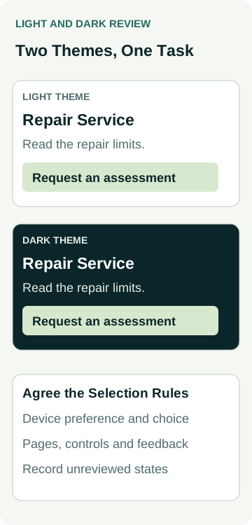
A Worked Example: A Repair Business Enquiry Route
Imagine a repair business considering an optional dark theme for a new website. Its owner wants customers to understand the repair limits and request an assessment. This is an illustrative planning example, not an AWE client, tested website or accessibility result.
The proposed first visit follows the device preference. A visitor can choose light or dark on the website and can choose to follow the device again. The owner asks the developer to document what happens on another page and on a later visit before approving that part of the scope.
The designer and owner use this record for the service-to-enquiry route:
| Review Area | What to Agree | Evidence to Request |
|---|---|---|
| Theme selection | Initial appearance, manual choice and return to device preference | Demonstration of the agreed choices and cross-page behaviour |
| Service information | Same repair explanation, limits and enquiry destination | Matching content reviewed in the actual light and dark layouts |
| Controls and feedback | Menu, focus, form instructions and relevant messages | Recorded checks of the included states in both themes |
| Exceptions and upkeep | Alternate logo, connected tools and responsibility for later edits | Approved assets, coverage limits and named follow-up owner |
In a hypothetical review, the alternate logo is still awaiting approval and the booking widget has not been checked. The owner records both as unresolved. They do not approve the complete theme feature solely because the service-page screenshot looks finished.
The diagram and record describe what to review. They do not demonstrate a working theme switch, actual contrast measurements, enquiry delivery or a customer outcome.
Keep Both Themes in the Editing and Launch Plan
Ask which colours and components are shared, who maintains them and which checks staff should repeat after a content update. A new graphic or contact panel may need review in both themes. Our shared-content change guide helps establish which pages an edit affects.
Have the provider distinguish included theme work from further image preparation, connected-tool changes or a broader accessibility assessment. Keep any missing asset or untested feature in the record with a person responsible and a next action.
Add the agreed checks to the website launch review and repeat the relevant route on the public site after launch. Later changes in visits or suitable enquiries need their own evidence; theme acceptance alone does not establish a commercial improvement.
To discuss the feature, review AWE's website options or contact Australian Web Experts with the pages, theme choices and customer tasks you want included. Ask for the design, behaviour, review and ongoing responsibilities in the actual proposal.